JLC
Client: JLC construction company
Project: Brand strategy and positioning; brand identity and website layout.
Location: Santa Catarina, Brazil.
JLC means now “Jeito Líder de Construir” (leader's way of building).
We strategically repositioned a company with a 40-year history, a pioneer in civil construction in the northern coast region of Santa Catarina, with the aim of reaffirming and strengthening its prominent position on the local scene.
CHALLENGE
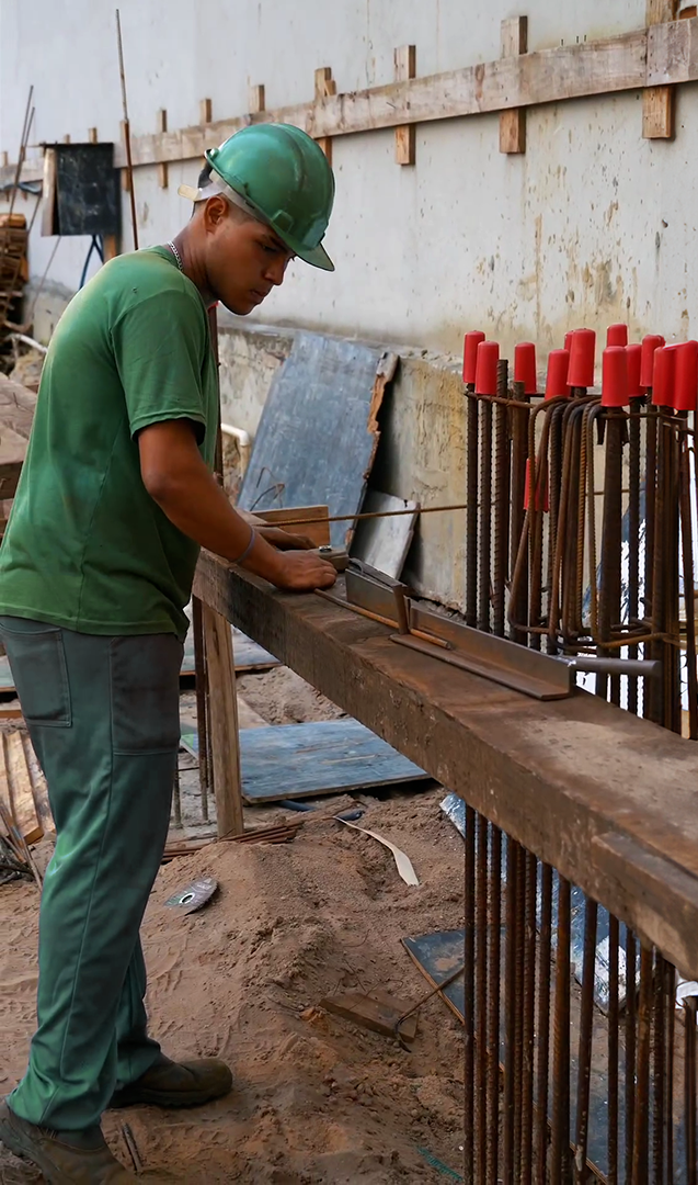
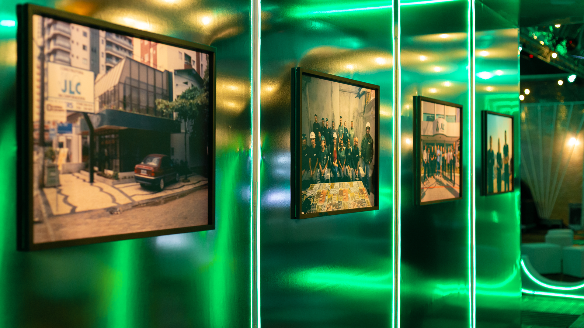
About to celebrate four decades of history, with more than 200 thousand square meters built and the delivery of more than 28 multifamily buildings, the company went through a moment of family succession after the loss of its founder, and it became necessary to rescue this great legacy to show the construction market that JLC remains committed to its mission of delivering results and continuing to lead by example.
SOLUTION
We created a new positioning built on the JLC name. Before, the initials of José Luiz, founder, and Cleber, the eldest son, now represent the essence of the work philosophy and the unique way of building that only JLC has - the “Jeito Líder de Construir” (leader's way of building).
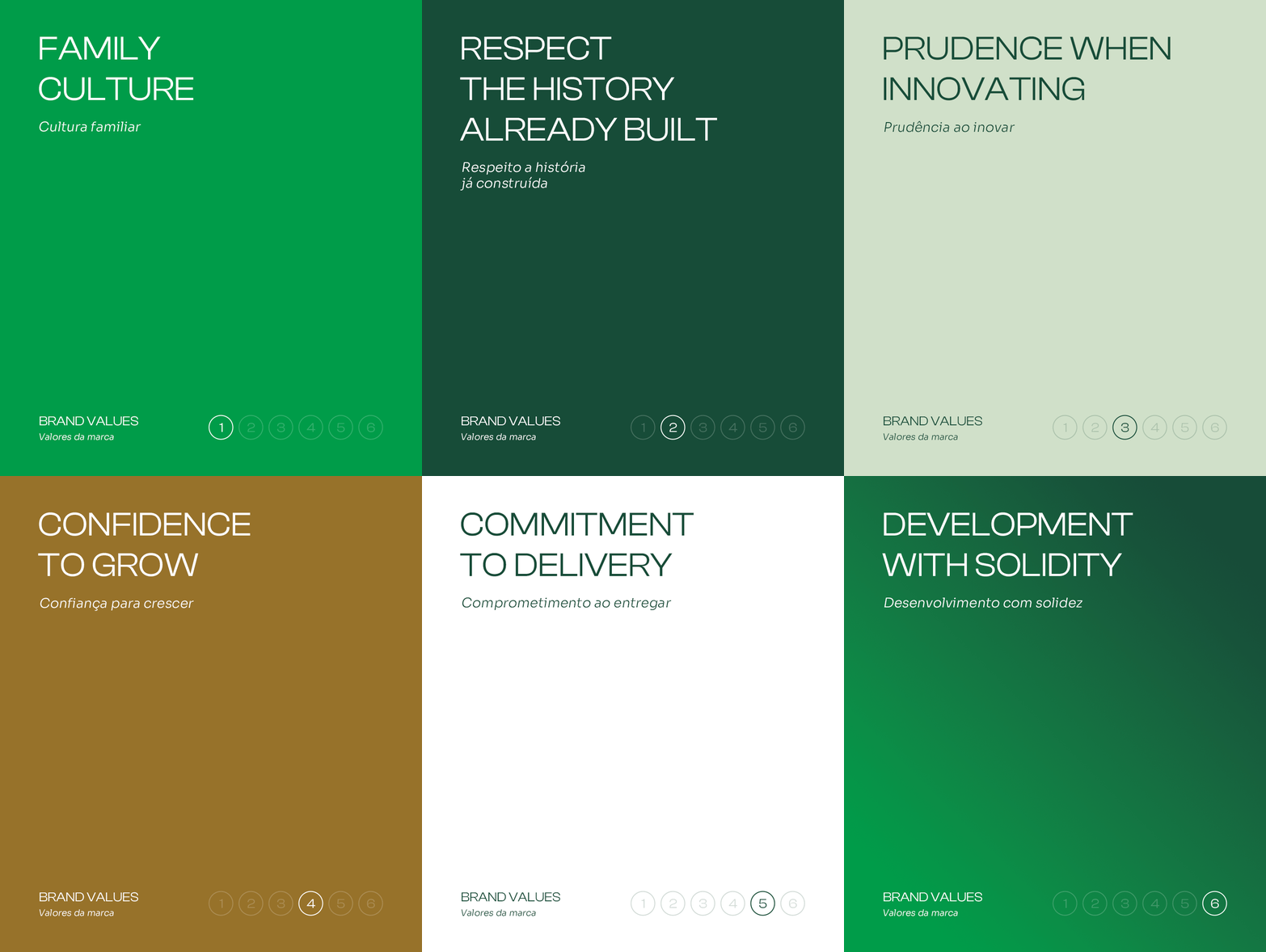
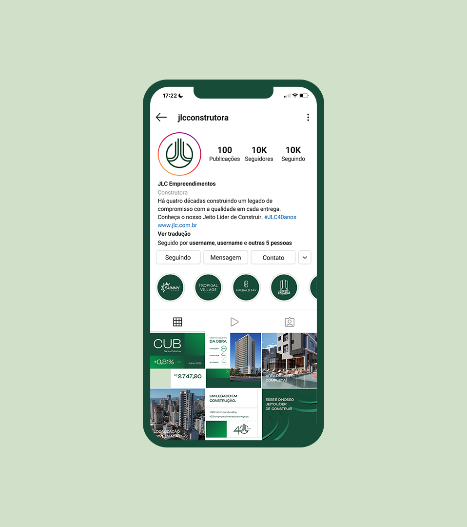
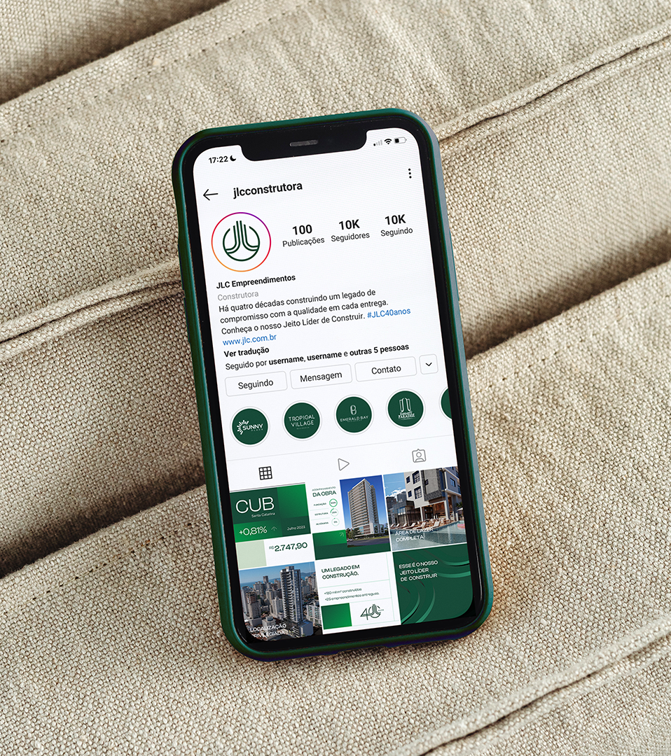
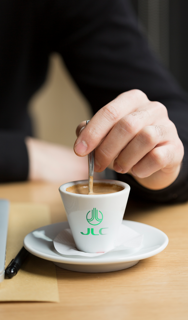
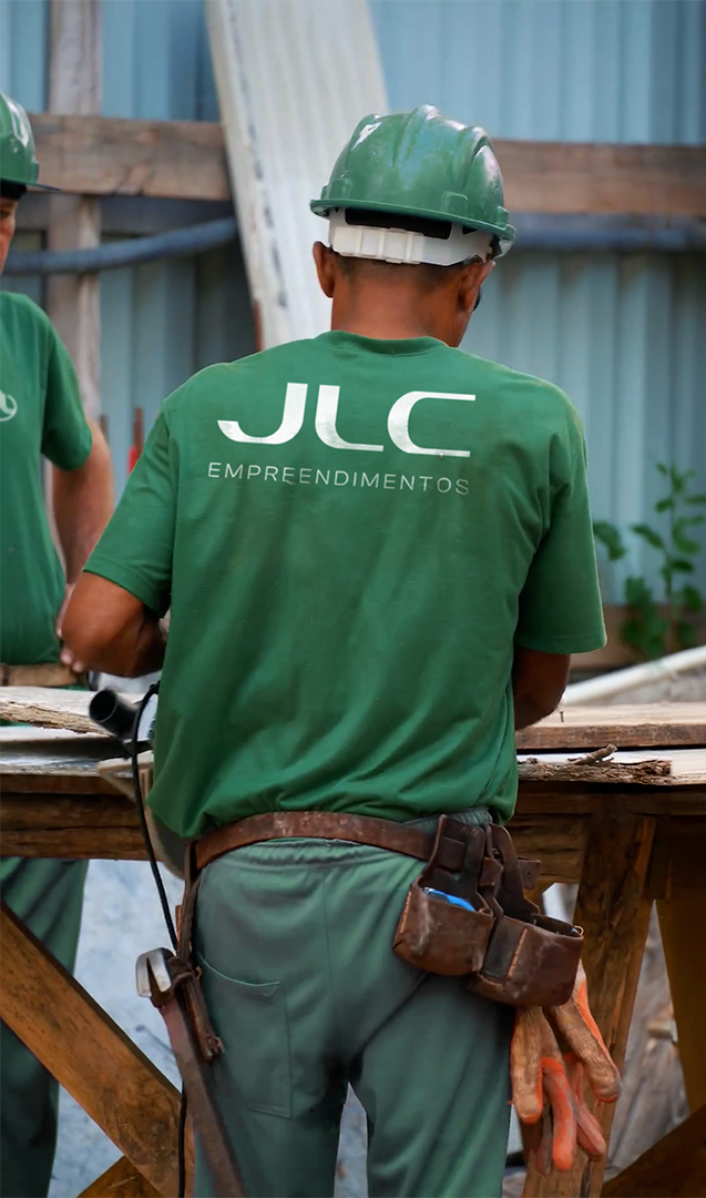
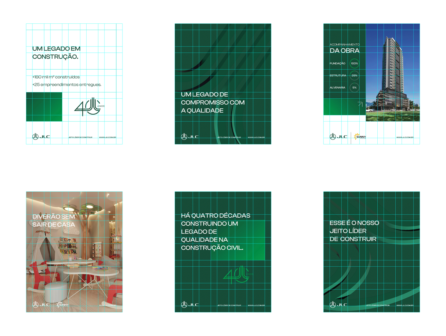
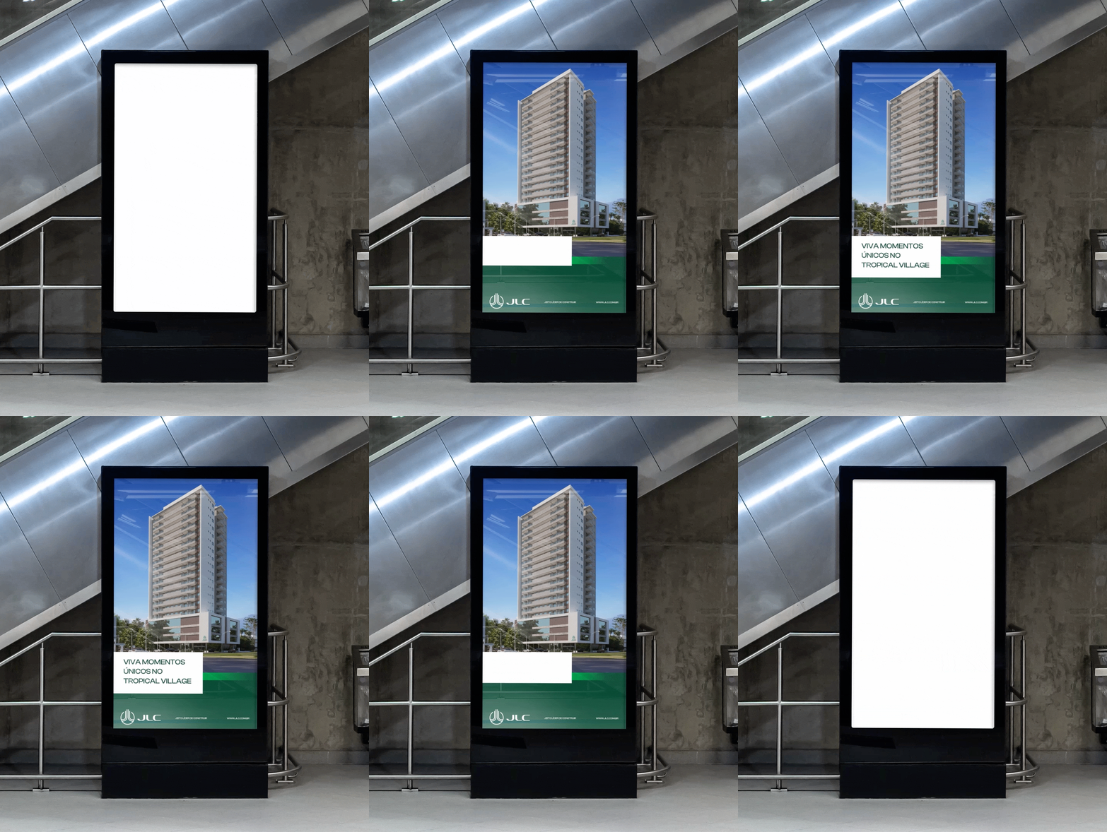
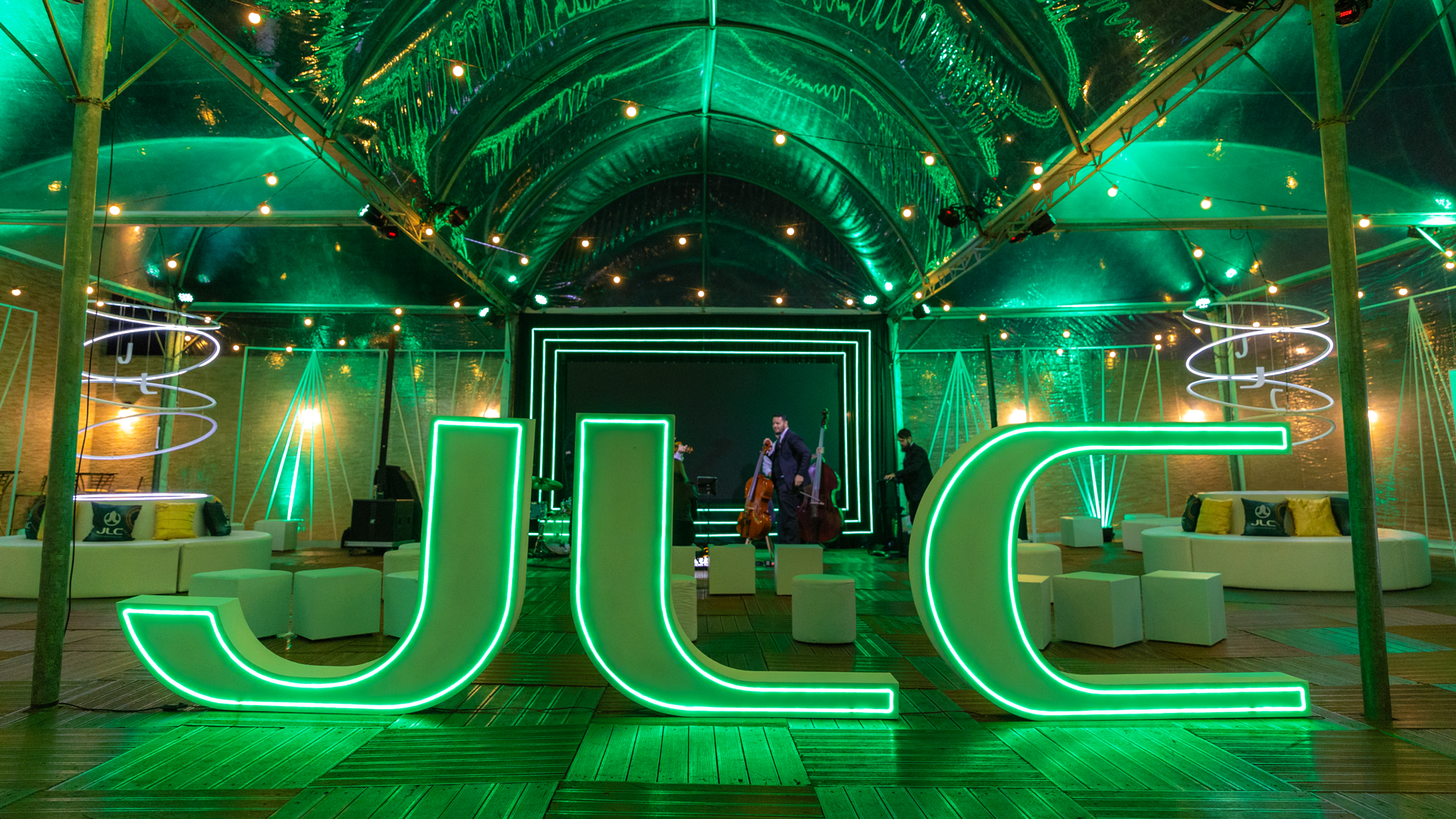
We also evolved the entire visual territory of the brand, preserving its history and maintaining its identity traits. In this process, we maintained fundamental characteristics that already generated strong brand identification, such as the green color and the logo shape, while updating all elements to reflect the vision and management of the company's new leadership.



THE EVENT
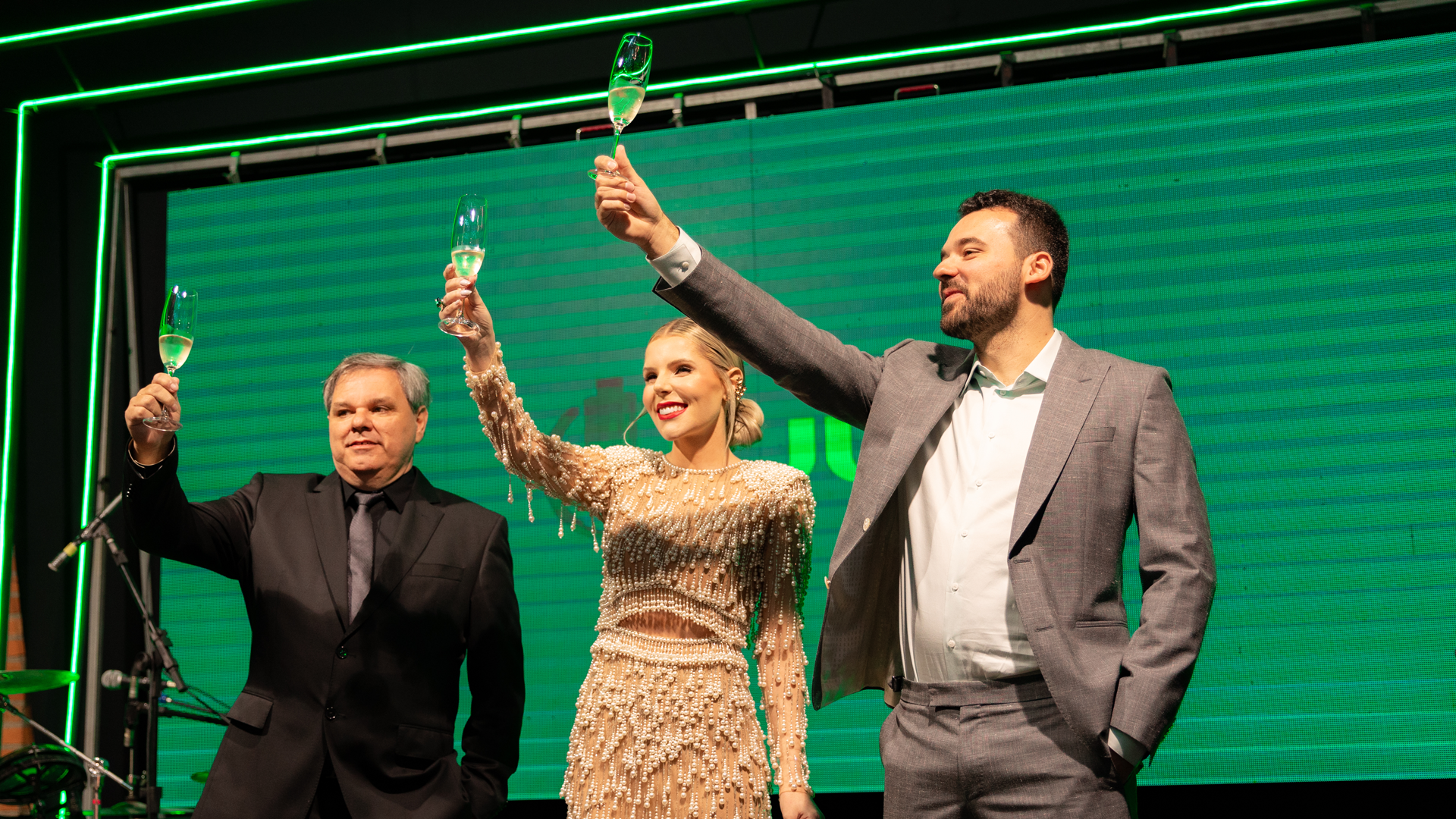
September 14, 2023 was marked by a special event, which began this new chapter of the company with the presentation of its new brand and positioning, together with the celebration of its 40th anniversary. The event was attended by business partners, friends and local authorities.

A brand designed by Portulan.® Brand Guide Company.. All rights reserved.


