Fogo Seguros
Client: Fogo Seguros - Insurance Broker Company
Project: Brand strategy and positioning; iconography; motion design and brand identity.
Location: Santa Catarina, Brazil.
Fogo is an insurance brokerage and administrator with a different discourse. Instead of talking about the risks and dangers, prefers to talk about a life without the unexpected, with more time for you and your family. A more peaceful and secure life.
“We want to teach Brazilians the role of insurance in protecting their family and property and make more people have access to effective protection in all areas of their lives. Our vision is to create a world where our customers can be confident they are safe.” said the partner and director of the company, Marcelo Ximenes.
CHALLENGE
The company was looking for repositioning and differentiation in the market, offering a 360º service, supplying all areas of need in the customer's life. Which, in fact, makes each person's world a safer place.
SOLUTION
We summarize in a short sentence what sums up all of Fogo's new positioning - You safe. All the time. This sentence translates the brand's promise of a service that is personalized, exclusive, and complete.
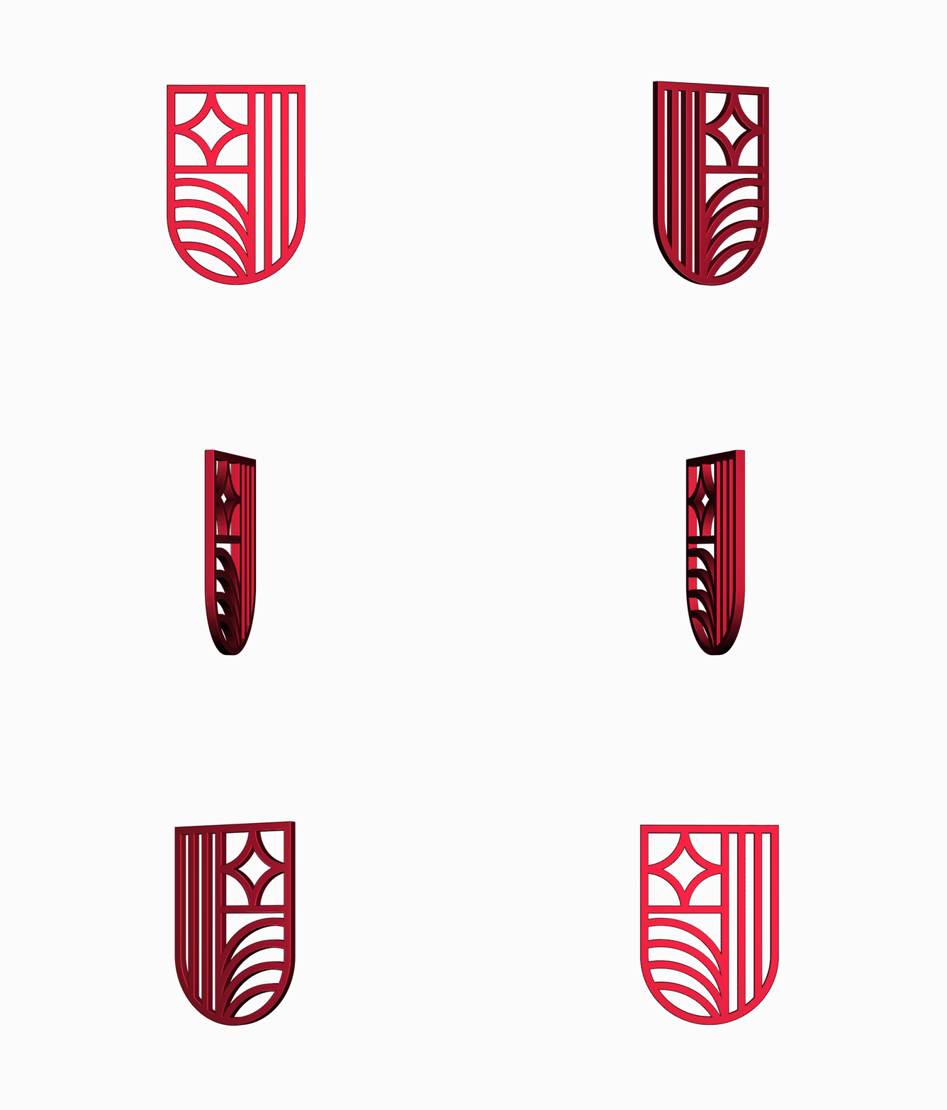
From this positioning, we build the symbol that is part of Fogo's logo. This symbol is expressed in the brand's visual universe as a field of protection and security, but it also refers to a watch and a complete cycle, that is, time and completeness.
A brand designed by Portulan.® Brand Guide Company. All rights reserved.


